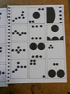
Okay so for this project, we were supposed to illustrate three of the Gestalt principles: Proximity, Continuance, and Similarity. I kind of had trouble with these. Does one show proximity by clustering all of the dots together, or by leaving a dot out by itself? Does one show similarity by making all but a few of the dots different sizes? What even IS continuance? These thirty thumbnail sketches are the result of me bumbling around without any real sense of direction.
These aren't really organized in any way, so have fun trying
to figure out which one is which, I guess?
Okay flip your head turnways for this one
We weren't supposed to crop them at all, though. I had remembered reading that before starting work, but then I noticed that I had already done it, so I decided to just roll with it. Whoops! Kathy said she liked them though, and that out of everyone that did it, I alone could keep them. I thought that was unfair for everyone else, though, so I only used one of them.
So from these 30, we narrowed it down to 5 from each concept that we liked the best. We then enlarged them to be 6x6 inches on white cardstock.
Like this.
From there, we narrowed it down to our very favorite from each category.
Proximity.
Similarity.
Continuance.
Getting tired of dots.


No comments:
Post a Comment